
We asked the board of directors and chapter presidents at the AIGA (American Institute of Graphic Arts) to look at women’s sports logos through a designer’s eye — putting team loyalty, fandom and familiarity aside — and tell us which ones they thought were doing it best.
Their favorites?
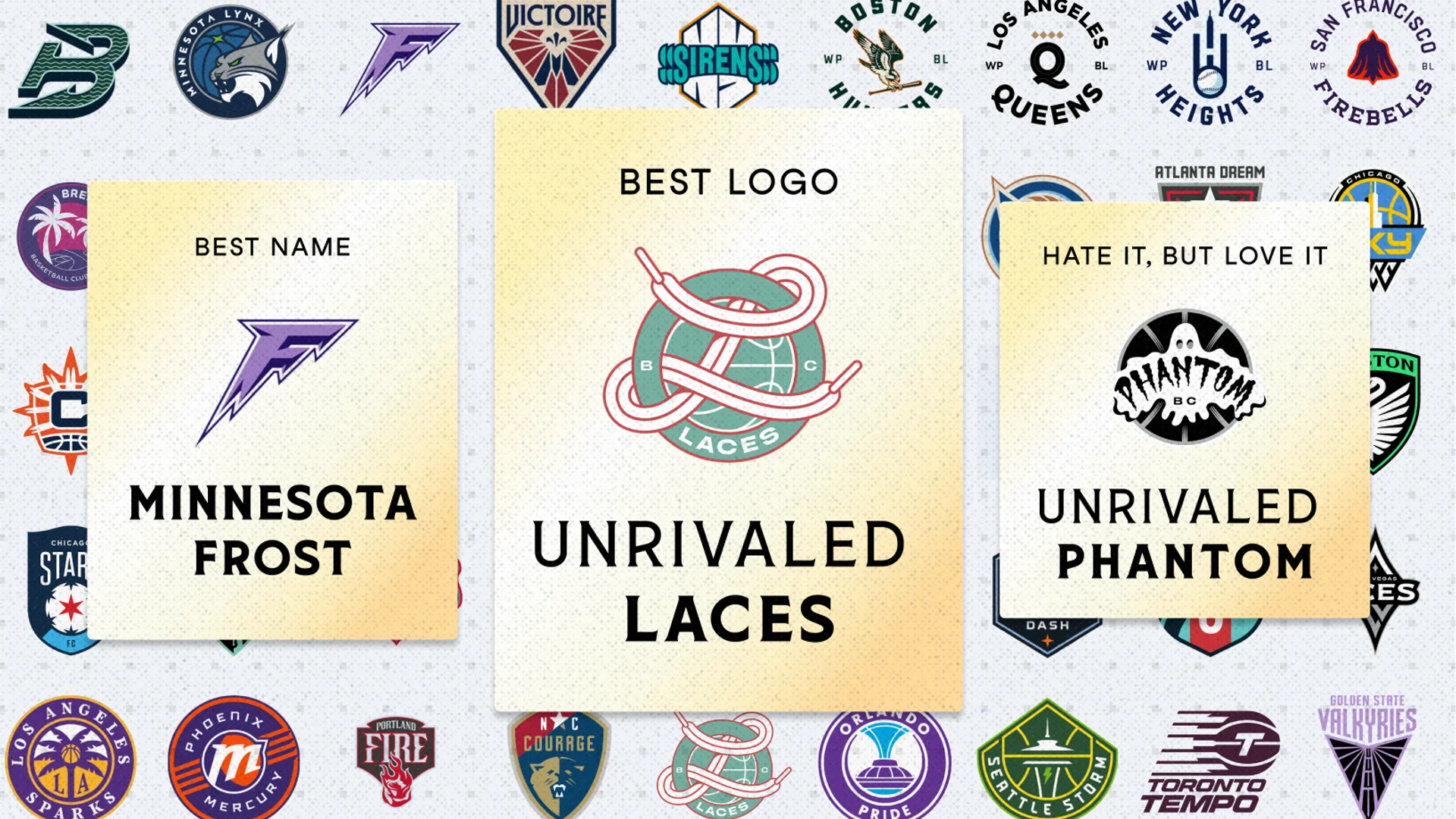
The Laces and the Minnesota Frost.
Maybe not the two names even diehard women’s sports fans would have predicted. And that’s what made the results so interesting.
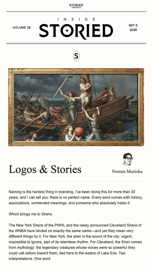
The Golden State Valkyries are sleek, modern and strong. The Laces of Unrivaled break many of the traditional rules of sports-logo design — even the way the laces wrap around the mark feels unexpected. The Minnesota Frost evoke both movement and chill. Each tells a story before you know anything about the team behind it.
As Noreen Morioka points out, that’s the opportunity: women’s sports don’t have to inherit the visual rules of the past. New teams get to create their own identities — and design can help set the stage.
Now we want your vote.
Take the test!
Put your team allegiances aside, and look at the logos purely through the lens of design. Which teams are getting it right? Which identity connects with you most?